Tuesday, November 23, 2010

Delicious cigarettes


I decided to have a shorter and more eye-catching blog post title this time (which I noticed other bloggers do, so I thought I ought to try it out too :P ).

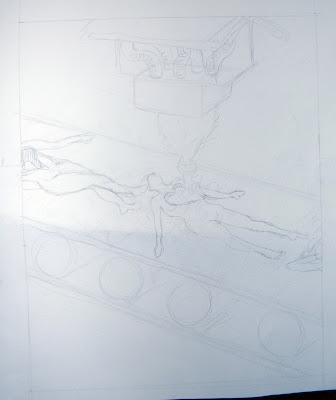
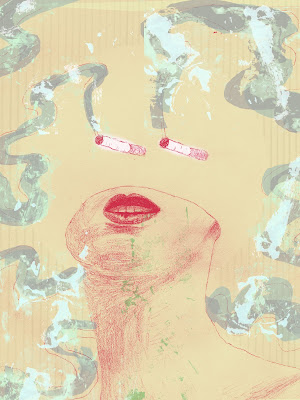
Anyway, this my final illustration for Illustration Topics, in progress. I really like where it's going right now; I'm using some elements of texture that I have not really done before, and I'm excited about the color as well (I have to give credit to Tom Garrett, and also Teagan White, for some of the color suggestions. One of these days I will absorb their color know-how into my brain well enough to think of good backdrops and line colors and such). I'm not sure how I like using the realistically drawn figure; BUT, I do like how I have it kinda surreal, with her cut off, and the floating cigarettes.. in some weird way I like that...weirdness, instead of a completely realistic illustration.

Oh, and what it's about: we had several short phrases or just single words to select from, and I chose 'Delicious' (I also considered 'Chain Reaction'...so, somehow this may be related to that, too). Anyway, it's about cigarettes and people who smoke them, and how 'deliciously addictive' they are, but then at the same time obviously unhealthy; but people for some reason like doing this unhealthy, maybe 'edgy' thing, and sometimes they even try to make it look glamorous or sexy. But in the end it's just unhealthy, and I personally don't understand why people smoke, and I think the attraction factor goes way down (in my book at least) when I find out someone smokes. So, it may be about seeing an attractive person, then finding out they smoke, and then that's all I can think about, forgetting about the initial attraction.

It MAY change in composition for the final, but probably not. There will be more textures on the smoke probably...we shall see where it goes. It's going to be a 30" x 40" print out :O

A biographical comic from Intro to Comics


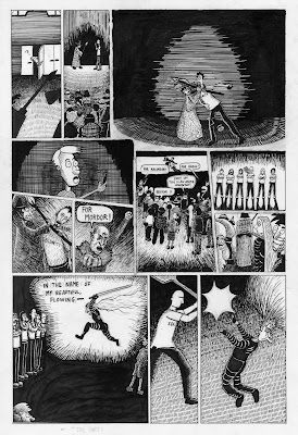
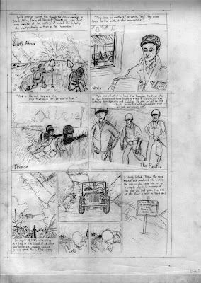
Intro to Comics was a while ago (Spring 2009), but I was going through some folders and finding things I thought would be fun to post. So, here's a 2-page, biographical comic, about the war-time journalist Ernie Pyle (World War II), pencils and inked pages. The inking's a bit rough looking, but it was only my second time doing real 'comic inking'. I've always liked stippling stuff, so I like how those parts looked. Figuring out where the larger black spots and middle toned shapes should go was more of a challenge, and I think I've improved in that area a bit, but could still use some improvement (though I don't do a ton of just plain black and white stuff like this as much anymore).

Monday, November 22, 2010

New Much Better Quality Children's Book scans


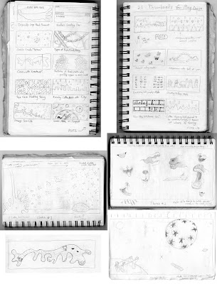
Here are scans of the sheets that I have my storyboards on (now in their entirety, and scanned at 300 dpi and then merged together...I used Curves to make them more viewable, which also made the paper and eraser marks and all that visible, but oh well). One thing I'm noticing is that I need to work on line weight more, even in my sketching phase.. otherwise I like most of the page layouts. I have the writing done too, though it could change in the final version.

Anyway, here they be.

It's way later than I should be up right now, considering I have class tomorrow at 1 pm, and then night class, and will probably be tired through all of them.. :P O well, I really wanted to post these new scans.

Saturday, November 20, 2010

Children's Book Storyboard Snapshots


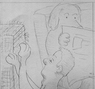
Here are some snapshots of parts of a storyboard for our final 32-page dummy in Children's Book Illustration class. I am pretty happy with how it all turned out, even if some things may be adjusted in the final version. I just felt good making this, and even for the pages that aren't as clear yet, I still felt like I liked where I envisioned it going; it feels pretty close to the kind of way of drawing that I'd like to continue doing.

Edit: I know that the quality of these aren't too great; I was using a scanner I got off the free shelf that is in my apartment (which I don't know how to adjust the dpi on yet), because I didn't feel like walking back through the cold to the main building :P I will have better scans to post later.

Saturday, October 30, 2010

Post that was meant to be a 'mobile post'

Somehow I sent a text to what was supposed to be my blog, from my phone, and it ended up as three separate, garbled messages. Oh well. Here is what the original text was:

"Giving tea a try at infinitea and watching scary costumed kids go in and out. Saw a Mario! that mom raised her son well. maybe i will get a twitter for non-art mobile posts. oh and I don't think I'm converted on the tea yet; or at least this iron goddess of mercy. (oh a Luigi maybe just walked in?)"

I did ask if I could have some honey to add to the tea, and ended up pouring quite a lot of honey in...then it tasted better. Maybe I will find a tea that I like, someday..obviously I haven't even tried that many yet.

Oh, and I will select some kind of art/sketches/process stuff to post soon...

Wednesday, October 27, 2010

For fun summer sketches


I ought to do something more to some of my sketches as a next step.. like color.


Tuesday, October 26, 2010

A Comic

This is actually "Piece 1" that I had in my Junior Review; it's the one non-Illustration piece I included, and is the earliest piece chronologically (Spring semester 2009, for Intro to Comics; the final comic), that I showed in my presentation. It is a fictional story based loosely on my experience at Anime Detour a couple years ago. Go ahead, read it.. it looks rough when you zoom in, I just noticed, which is unfortunate..I couldn't find the cleaned up version, so for now this will have to do I guess.


Saturday, October 23, 2010

Junior Review - Piece 3 & 4 - "90s Shoes" & "MCadet"

Here are pieces 3 and 4 that I will show in my Junior Review. I am posting the pieces in chronological order according to date of creation, but I will probably be showing them from newest to oldest in my presentation instead. (Oh.. I just noticed it uploaded the images in the wrong order; I did the shoe one first in my Concepts & Metaphors class, and then did the mug design just this semester for Illustration Topics)

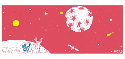
This first one, the mug one, was for the MCAD Mug Design contest. I decided to show the process work first, so you can peruse that before scrolling down to be amazed at what the final piece looks like (instead of how I did it in previous posts, where you see the final piece right away; I think this is more interesting :P )


And here I have the process work, which involved a lot of brainstorming and writing, for the beginning of the trip-tych that would be 'the shoe assignment' (they were actually going to be in book form, so a couple would be facing one another; so I guess not exactly a trip-tych?). Anyway, for the 'Review, I am just showing one of the three, which is the one about the 'shoe of the '90s', which I chose to be a Chuck. I actually attained a pretty old pair of them from an employee at a used bookstore in Dinkytown, who let me have them for free, which was pretty cool! I gave them back to him a couple weeks after I used them for reference, though, because it sounded like he may have been reluctant to part with them. The final piece is supposed to be showing a boy/teenager in the '90s, who was heading into this age saturated by 'the digital', but meanwhile kids still often had these shoes that showed the wear and tear of playing outdoors, even with the coming of computers and unfortunately a lot more staying indoors for some kids. Not sure if all that was clear (in how I worded it and in how I showed it in the art), but I like some of the new things I was doing with combining digital/traditional medium.


Junior Review - Piece 2 & Process Work

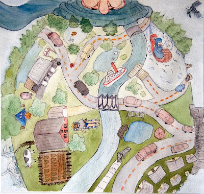
Here is the second piece that will be in my Junior Review. This was a piece I liked for its concept, which was 'what comes to mind when I think of Minnesota' (which was the assignment, but I like how I really got into this one conceptually). It's geographically divided into the different areas of Minnesota, roughly. And it's a person with a big thick winter coat on :P


Junior Review Gathered Process Work Part 1


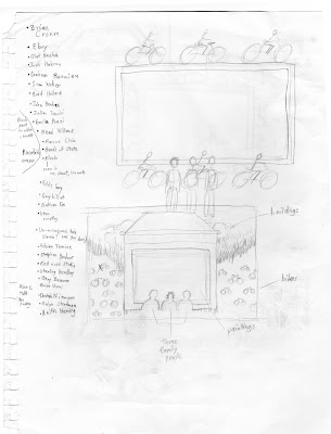
Here is part 1 of process work (sketches, thumbnails) that I gathered for my Junior Review on Monday (the piece above is the final piece, and below is the process work). This is for a piece all the way back in Intro to Illustration; it involved interviewing a classmate about a memorable holiday or vacation they took (or some kind of memorable event). The person I interviewed told me about a trip he took to Amsterdam with his family, which included some details such as: lots of people biking, historical places, and many canals. In the final piece, I tried to focus on the bikes part, and also conveying the place by showing specific architecture based on photos of buildings in Amsterdam, and showing a hint of the canals; the empty space in the middle was suggested to remain empty, though I think I could put something there, maybe subtle ripples that make certain symbols that are related to Amsterdam's history.


Monday, October 11, 2010

I am testing a post from my phone to my blog. Will upload more process work soon.

Tuesday, October 5, 2010

This is a design I made, and then went over in Illustrator to make it look vector-y. 'Was maybe gonna use it for the mug design assignment in Illustration Topics, but ended up deciding on something else instead.

This is the sketch that I used (I believe for the final version) for a gouache assignment in Tools of the Trade, with the theme "can't live without". So, what I feel like I couldn't live without is ears, and listening/absorbing all the stuff I hear around me. I'm a pretty quiet person so I do a lot of listening... :P
These are two sketches I just brought into Illustration Topics class today for the subject of 'Opposites', specifically 'cheap and expensive' (chosen from a given list). I am going to actually change the 'cheap' one to be in a child's sandbox, with the mouse perhaps relaxing on a leaf floating in rainwater in a plastic sandbox toy or bucket.

These two are the first sketches I had for an assignment in Tools of the Trade using acrylic paint, with the theme of 'Animal/Human', which was pretty broad, but I decided on this idea of animals ruling the world instead of humans; a role reversal I guess. I also wanted to draw a determined-looking guy pooping.

More and more and more


This image (which you can click on to make larger) is the result of looking at the album covers as I arranged them below, and creating some kind of interesting vertical format piece, that's fun to travel down. It was phase 3 of a three part assignment at the beginning of Intro to GD.

This is one of the versions of the end result of trying to develop a logo identity for First Ave. in Minneapolis. It went through many stages, including a 10 x 10 matrix on which we formulated our ideas, across a variety of categories and combinations of ideas. This poster contains the majority of the logo identity creations from that matrix, and from sketches.

These (above) are the preliminary sketches for a potential product design assignment, all the way back in Intro to Illustration.

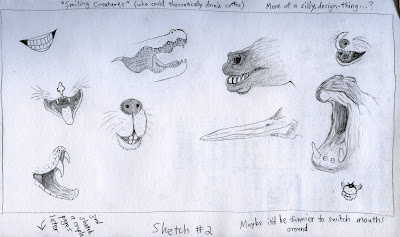
These are some smiling animal faces, for an assignment in my Illustration Topics class. These are just sketched ideas for a mug design assignment.

This an early sketch for an assignment relating to Harlequin Romance novels, also all the way back in Intro to Illustration. I had this symbolic idea about women who read the novels kind of wanting to fill an empty hole in their hearts with the romantic fluff of that genre..or something like that.


This is an early sketch, and some thumbnails on the side, for an assignment in Intro to Illustration also, about eco-friendly fashion.

This is a sketched idea for an assignment in my Intro to Illustration class (again) about government surveillance; specifically about how they record what we type (or at least that's the conspiracy).

And, here's one of a two-piece (diptych) self-portrait assignment I did for Drawing: Figure. I like this one more than the other one, in which I'm scrunching up my face (but got the proportions wrong for my head). This one's not perfect either, but I like it.

More sketches and process work